(1.1) California Dept. of Water Resources
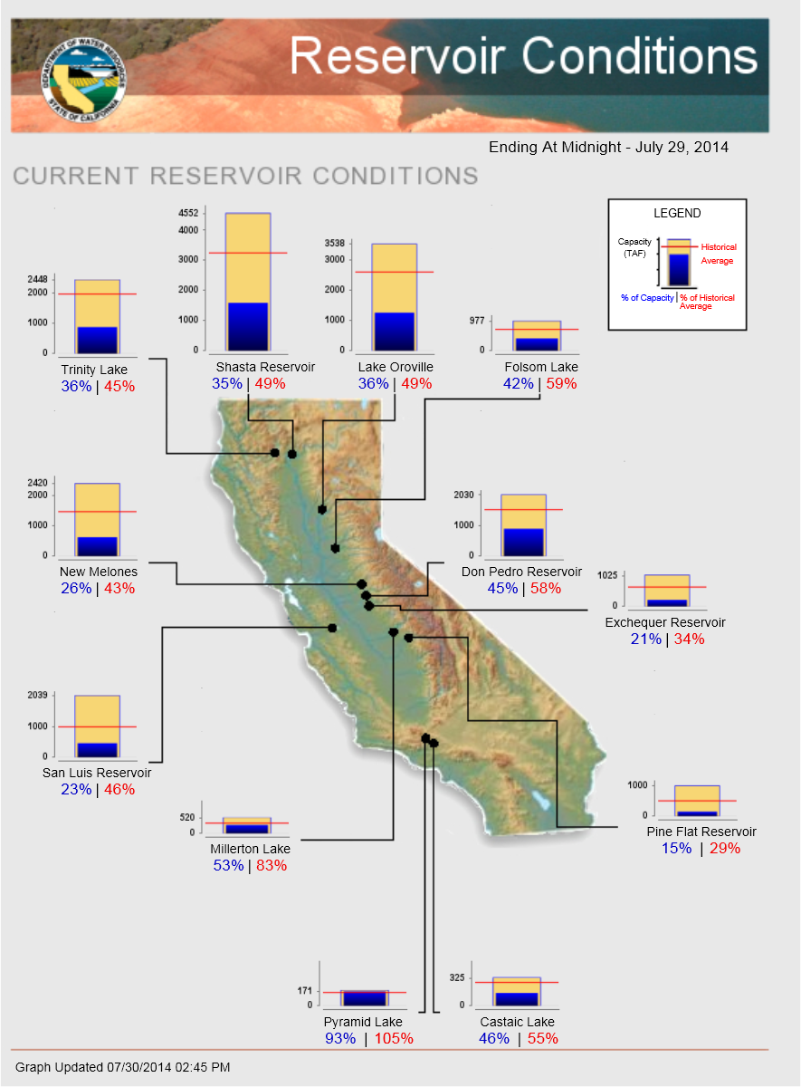
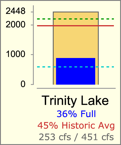
A visual tool on the California Department of Water Resources website provides a good example of the sort of Reservoir Teacup graphical element we would like to create.
RiverWare Output Canvas: Teacup Storage and Flow Animation: Design
3
Phil Weinstein, David Neumann, Patrick Lynn, Edie Zagona, CADSWES, 8-25-2014 (e)
-- See
Project Index
This document presents a design for a new RiverWare "Output Canvas" output device which can be used to illustrate water storage levels and water flows over a period of time. The initial implementation supports the following graphical elements, including timestep-animated components:
Subsequent development of the Output Canvas output device may provide additional graphical features, such as incorporation of RiverWare Plot Page and Pie Chart output devices. Output Canvases may eventually be deployable on the web. Those features are beyond the scope of this project.
Two examples of water resource Teacup graphics are provided here to help devise a design for RiverWare Teacup items.
(1.1) California Dept. of Water ResourcesA visual tool on the California Department of Water Resources website provides a good example of the sort of Reservoir Teacup graphical element we would like to create. |
|
|
|
||
| Source: http://cdec.water.ca.gov/cdecapp/resapp/getResGraphsMain.action | ||
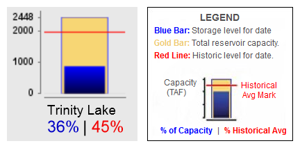
This visually depicts these quantities:
The Teacup Item also includes these text / numeric items:
The full map image depicts "callouts" -- lines connecting the Teacup image to a particular point within the map. (We will not be implementing this feature).
Most reservoirs seem to share a common vertical (volume) scale. But some smaller-capacity reservoirs have a larger scale (e.g. see Pyramid Lake at the bottom of the graphic).
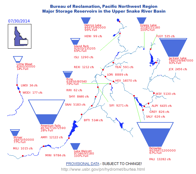 |
| Source: http://www.usbr.gov/pn/hydromet/burtea.html |
 |
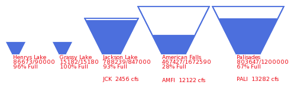 |
In this particular map, there are three Teacup "profiles" -- for different ranges of reservoir capacities. Each Teacup apparently has its own scale. The indicated flow ("cfs") text items are apparently independently placed (i.e. not implemented as part of the Teacup item). |
Observation: this trapezoidal presentation is potentially ambiguous. Ostensibly storage volumes rather than pool elevations are depicted by the filled-in area. But it's not clear whether the height or the area of the filled-in area represents that volume. And certainly the height of that area doesn't accurately represent the pool elevation.
Various types of Graphics Objects can be displayed on an Output Canvas -- a new form of graphical RiverWare output device. These Graphics Objects include:
Several of these objects graphically depict -- or display as text -- numeric values from slots in the model. Series slot values are indexed with a reference timestep provided by the canvas.
The following sub-sections summarize the capabilities and display options for these Graphics Objects. See also the configuration "Settings" sections for these objects later in this document.
Images are added to an Output Canvas by loading individual image files and are retained (as data) within the Output Canvas. Images can be displayed in the canvas with partial opacity. Particular images can be designated as "background images" which forces them to be painted "under" non-background images and changes their configuration behaviors.
Image Items can be created from basic image files (JPEG, PNG, GIF) and are saved (serialized) within the Output Canvas output device, generally contained within a RiverWare model file. The "Add Image" operation starts by showing an image file selection dialog to allow the user to pick an image file to be loaded.
Image items support an adjustable opacity (0% to 100%). Individual items can be designated as "background images". Doing so has the following effects:
In the Output Canvas Configuration dialog's canvas preview panel -- but not in the Output Canvas Viewer -- Images (and all Graphics Objects) are movable on the canvas, by dragging. The configuration preview panel presents checkboxes for locking the positions of: (a) All background images, and (b) All other graphics objects.
Text Items can be individually placed anywhere within the canvas. Several Text Item Types are supported as outlined in the table below. Text items support the following features:
Five (5) Text Item Types are supported:
|
||||||||||||||||||||||||||||||||||
 |
|
|
|
RiverWare Teacups can be individually placed anywhere within the canvas. Teacups belong to a particular Teacup Group which defines the display properties for all teacup instances in the group. Teacup instances have an associated primary simulation object (typically a reservoir) and secondary simulation object (typically a data object) which are used to identify the data sources (slots) for the values illustrated by the teacup graphic.
Teacups graphically depict individual slot values relative to the canvas' "reference timestep" using the following graphical components:
Additionally, Teacups display the following components:
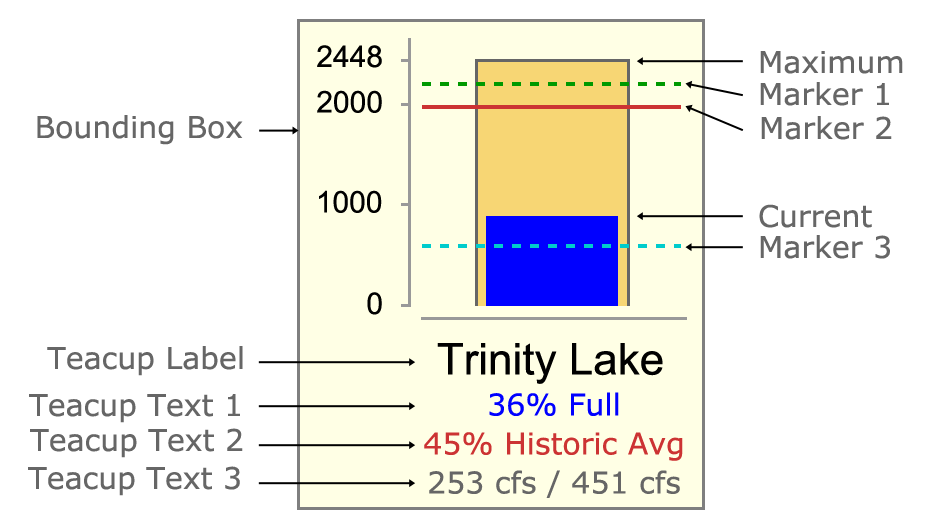
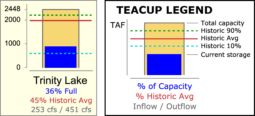
A Teacup Legend graphical image can be created for a Teacup Group and placed anywhere on the canvas. It is always drawn with a black border (bounding box) and a white background. It is similar to the teacup graphic, but with markers positioned vertically such that text labels can be placed to the right, evenly spaced. (See the accompanying image). In place of the vertical axis tick-marks with numeric values is the unit indication for those values. Only "legend text" for the Teacup Text Items is shown below the teacup bar -- no text is shown in place of the Teacup Label.
Each of the following graphical components are configured with a label or "legend text" used in the teacup legend.
Flow Lines are line segments graphically depicting an individual slot's value at the canvas' "reference timestep" with the following graphical attributes:
Each end of a RiverWare Flow Line can be placed anywhere within the canvas or "snapped to" any Teacup or Flow Line end. Flow Lines belong to a particular Flow Line Group which defines the display properties for all flow lines in the group. Flow Line instances have an associated primary simulation object (typically a reach) -- and optionally a secondary simulation object (typically a data object) -- which are used to identify the data source (slot) for the flow line's display properties -- and optionally to define thresholds using guide curve slots.
Flow Line Thickness is determined by a single function applied to all Flow Lines within a particular Flow Line Group. Specified minimum and maximum line thicknesses correspond to specified slot values. The graph to the right illustrates Flow Line Thicknesses (in pixels) as a function of slot values given this Flow Line Group configuration information:
|
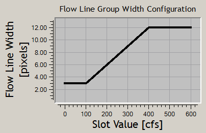 |
Note that Flow Lines are drawn with anti-aliasing, so fractional line thicknesses (interpolated between the minimum and maximum thicknesses) are meaningful.
Flow Line Color and Line Style (pattern) reflect magnitudes relative to the slot's "capacity" (typically, water channel flow capacity). These display attributes are defined in a sequence of "Flow Intervals" at the Flow Line Group level. The thresholds for those intervals are defined independently for each Flow Line Instance. Thresholds can be expressed as constant values -- or -- as references to "guide curve" slots (any slot under the Flow Line's associated objects which can be resolved to a single value, with or without a reference timestep). See the following example.
Flow Interval Configuration EXAMPLE:
| Configuration at Flow Line Group Level Flow Interval Display Attributes |
Configuration at Flow Line Instance Level Flow Interval Thresholds (Value or Guide Curve Slot) |
||||||
| Flow Interval | Label | Color | Style | Below Red Lake | Below Green Lake | Below Blue Lake | |
| Negligible | Negligible | Gray | Dotted | ||||
| Flow Interval 1 | Low | Gray | Solid | >= 2 cfs | >= 2 cfs | >= 5 cfs | |
| Flow Interval 2 | Middle | Green | Solid | >= 10 cfs | >= 80 cfs | >= 200 cfs | |
| Flow Interval 3 | High | Blue | Solid | >= 30 cfs | >= 240 cfs | >= dailyHighSlot | |
| Flow Interval 4 | Extreme | Red | Dashed | >= 50 cfs | >= monthlyMaxSlot | >= dailyMaxSlot | |
Generally, slots associated with Flow Lines have the "Flow" unit type. But any single unit type can be used. This is configurable at the Flow Line Group level. (All Flow Lines within a particular Flow Line Group must have the same unit type).
The locations of the two ends of a Flow Line graphics item are manipulated using other graphics items to which the Flow Line ends are attached. The end of a Flow Line which is not attached to a Teacup is implicitly attached to a Flow Line Anchor Point graphics item. Flow Line Anchor Points are used for both "free" (unattached) Flow Line ends and Flow Line ends attached to one or more other Flow Line ends. Flow Lines (as such) will not themselves be movable by dragging. Rather, each of a Flow Line's ends dynamically "track" either the Teacup or the Flow Line Anchor Point to which it is attached.
The various types of Graphics Objects depict, or display as text, numeric values from slots in the RiverWare model. There are several ways in which various graphical features are related to particular "data source slots".
In the most general context, e.g. for Text Items within a Text Item Group, slots are identified using "complete" slot name -- any slot in the model which resolves to a scalar value given a reference timestep.
In the case of graphical features of a Teacup or Flow Line, each data source slot reference is constructed from two components:
The following Data Source Types are implemented:
| Data Source Type | Used In: | ||
| 1 | Direct Slot Reference | Text Items in Text Item Groups | |
| 2 | Teacup SimObj-1 / Entity Slot Name | Teacup: Max; Current; Markers; Text Items |
|
| 3 | Teacup SimObj-2 / Entity Slot Name | Teacup: Max; Current; Markers; Text Items | |
| 4 | Flow Line SimObj-1 / Entity Slot Name | Flow Line: Value; Flow Interval Threshold |
|
| 5 | Flow Line SimObj-2 / Entity Slot Name | Flow Line: Value; Flow Interval Threshold |
An Entity Slot Name is a local slot name identified at the group level for particular graphical entities. These local slot names are applied to a reference simulation object supplied by each Teacup or Flow Line instance. Teacup Groups and Flow Line Groups provide an Entity Slot Name for each of these graphical entities:
Note that the Teacup and Flow Line variants of the Data Source Types listed above implement the same data source slot reference algorithms. They are enumerated separately to more easily provide customized GUI representations for these two contexts (teacups and flow lines).
Additional Data Source Types for other data source topologies are possible. Below are a few examples. These make use of Data Objects designated at the group level to provide values for multiple Teacups or Flow Lines in the group.
| Possible Future Data Source Types | Most Suitable For: | ||
| 6 | Entity Data Object / Teacup SimObj-1 as Slot Name |
any entity | |
| 7 | Entity Data Object / Flow Line SimObj-1 as Slot Name |
any entity | |
| 8 | Entity Data Object Single-Column Table Slot / Teacup SimObj-1 name as Row Label |
scalar entity, e.g. Teacup Maximum |
An Output Canvas is configured with the Output Canvas Configuration Dialog. Its design is based on the RiverWare Model Report output device configuration dialog using an Object Tree / Property Editor GUI design.
The Output Canvas Configuration Dialog presents three main panels:
|
The Output Canvas Configuration Dialog's GUI controls include:
Notes:
The output canvas Object Tree presents a hierarchical view of the canvas' Graphics Objects. The following outline illustrates the supported object structure. Multiple instances are supported except where noted. New Object Canvases have only a "Canvas Configuration" item, and that item cannot be deleted.
The Settings (properties) supported for each of these object types are described in subsequent sections.
Multiple instances of the following types can be reordered (within their siblings) using up and down arrow buttons:
The Object Tree panel presents an "Add Item" action menu for each of the item types listed above (except for "Canvas Configuration" and Flow Interval Threshold item types). The "Add ... Group" actions are always enabled. Other actions are enabled only if the selected tree item indicates a supported context for the new item type. The "Add Item" action menu supports several variations of certain items. (Note: We could instead deploy these variations as a setting, but that requires dynamic manipulation of the accompanying dependent settings). The "Add Item" action menu has these items:
The Output Canvas Preview panel presents an editable version of the Output Canvas. It reflects the configuration changes made in the Object Tree and Settings property editor. This view has workspace-like features, such as selecting and moving graphical features by dragging with the mouse.
The Output Canvas Preview panel supports:
The "Add" actions in the context menu create a new tree item in the object tree, and select that item. This causes the Settings property editor to show the default settings for that new item. The various types of canvas items also support their own context menus. Generally, operations in those item context menus apply to the full selected set of items.
The Output Canvas has a configured size, in pixels. Zooming in or out is not supported. Scrollbars will be shown as needed (i.e. when the Output Canvas window is smaller than the configured size).
Double clicking any object in the canvas preview selects the corresponding item in the Object Tree. This shows the item's configuration settings in the Settings property editor.
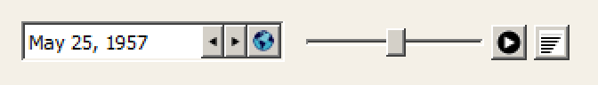
Similar to the Pie Chart device, the Output Canvas Preview Panel (and also the Output Canvas Viewer) provide a timestep slider with animation controls to allow the user to move timestep-animatable items to different timesteps within a model data time range -- and to automatically step that timestep forward at a settable rate to present an animation or slide show. This provides the canvas' reference timestep.
 |
The Settings property editor shows the Output Canvas' general settings when the "Canvas Configuration" item is selected in the object tree:
|
The reference timestep date/time is generally synchronized with the timestep slider shown with the canvas. Manual changes to the slider (including using the step buttons) change this value, but changes to that slider during an animation do not.
The initial implementation supports only a single Image Group which is implicitly created when the user adds an image. Its item label in the Object Tree is "Images". Image Groups support the following settings.
|
Image instances support the following settings.
|
*Although these values will be represented and serialized as rwSettings, they will not generally be visible in the Settings property editor. They will be visible only in a special debug mode, for development.
Text Groups encapsulate Text Items which are not part of a Teacup graphic. (Text Items can also be added to Teacup Groups for numeric text lines under the teacup label). Text Groups support the following settings.
|
Text Items can contain multiple lines of text with a single selectable color. Section 2.2 Graphics Objects: Text Items earlier in this document outlines Text Items' configuration features.
Five (5) Text Item Types are supported.
|
||||||||||||||||||||||||||||||||||||||||
Text Items in Teacups support only the text item types having at least one slot reference, as indicated above. On Teacup Text Items, such slot references (Data Source Slot References) make use of configuration information provided both by the containing Teacup Group and the Teacup instance. Slot references on normal Text Items in Text Item Groups are "complete" slot names to any slot in the model (scalar, series, or periodic).
All Text Item Types use the following settings:
|
*Although these values will be represented and serialized as rwSettings, they will not generally be visible in the Settings property editor. They will be visible only in a special debug mode, for development. Also, these values will not be supported for Text Items in Teacups.
These user supplied text string settings are used on particular text item types or contexts, as noted.
|
The following special settings are also used particular Text Item Types, as noted.
|
Various Teacup composition and display properties are defined at the "Teacup Group" level. These properties are shared among all Teacups in the Teacup Group. The accompanying image is the result of the Teacup Group also containing these configuration-detail items:
Teacup Groups support the following settings. |
|
|
|||||||||||||||||||||||||||||||||||||||||||||||||||||||||||||||||||
All information required for Teacup Legend appearance is available from the containing Teacup Group and certain configuration-detail objects within that group. The Teacup Legend supports the following settings.
|
*Although these values will be represented and serialized as rwSettings, they will not generally be visible in the Settings property editor. They will be visible only in a special debug mode, for development.
The Teacup Legend example illustrated below is a result of Teacup Group settings and settings within the following configuration-detail objects added to the group:
When instantiated under a Group item, the Bounding Box is displayed on all items within that group. The initial Bounding Box implementation is limited to Teacup Groups.
Bounding Boxes support the following settings.
|
Marker Specifications are currently implemented only for Teacup Groups. Multiple Marker Specification items can be added to a group. Marker Specification support the following settings.
|
|||||||||||||||||||||
Most Teacup display attributes are defined within the containing Teacup Group. Teacup instances support the following settings.
|
*Although these values will be represented and serialized as rwSettings, they will not generally be visible in the Settings property editor. They will be visible only in a special debug mode, for development.
Various Flow Line composition and display properties are defined at the "Flow Line Group" level. These properties are shared among all Flow Lines in the Flow Line Group.
A list of Flow Line Interval Declarations objects is also part of Flow Line Group display configuration. Flow Line Interval Declarations provide a Flow Interval label and associated line display properties: color and style (pattern). As the user adds and removes Flow Line Interval Declarations to/from a Flow Line Group, the same number of Flow Interval Threshold objects are set on all Flow Line instances in the group. Those provide specific Flow Interval threshold settings for the particular Flow Line instance.
Flow Line Groups support the following settings.
|
|||||||||||||||||||||||||||||||||||||||||||||||||||||||||
A list of Flow Line Interval Declaration objects is part of Flow Line Group display configuration.
As the user adds and removed Flow Line Interval Declarations to/from a Flow Line Group, the same number of Flow Interval Threshold objects are set on all Flow Line instances in the group. Those provide specific Flow Interval threshold settings for the particular Flow Line instance.
Flow Interval Declarations support the following settings.
|
Flow Line items are added on demand by the user. When adding a Flow Line item, or any time thereafter, the user configures the item according to a line item configuration established for the containing Flow Line Group.
Flow Line instances support the following settings.
|
*Although these values will be represented and serialized as rwSettings, they will not generally be visible in the Settings property editor. They will be visible only in a special debug mode, for development.
The number of Flow Interval Threshold items under each Flow Line instance is dynamically updated when Flow Interval Declarations are added to, or removed from the Flow Line Group.
Flow Interval Threshold instances support the following settings.
|
The threshold values above represent the "bottom" of the entity's (typically, reach's) Flow Interval value for the particular Flow Interval. Values below the lowest threshold value are displayed with the Flow Line Group's Negligible Value Color and Line Style.
 |
|
|
|
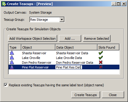
Multiple Teacups for a set of simulation objects (typically, reservoirs) can be created with a single operation using the Create Teacups dialog. This operation is available once at least one Teacup Group has been defined -- this provides the data source slot definitions which can be applied to a set of objects, with a set of associated data objects.
See the accompanying dialog mockup image. The user selects a Teacup group and adds simulation objects to an object list -- either from a selection on the workspace or using the object selector. The dialog attempts to locate associated Data Objects for all simulation objects added to the list by searching for data objects whose names start with the added simulation objects' names. If no such data object is found, the Data Object column cell is left blank.
Given the particular simulation objects, and the local slot names defined in the Teacup Group's configured Data Source Slot References for the particular graphical components (Maximum, Current, and each of the Markers), the dialog attempts to identify particular slots. The "Slots Found" column indicates the success of that slot lookup: A Green-Check icon is shown if all slots are found for the particular simulation object / data object pair. Otherwise a Red-X icon is shown.
When all object items are valid (i.e. with slots found for all Teacup graphical comontents), the "Create Teacups" button becomes enabled. Clicking the "Create Teacups" button creates the new Teacups and shows a message box confirming the completion of the operation and reporting its status. The operation will fail if the "Replace existing Teacups having the same label text (object name)" checkbox is not checked and such conflicts exist.
New Teacup objects are heuristically placed on the Output Canvas based on the relative positions of the corresponding simulation objects in the Simulation View; the user will then be able to adjust their positions by dragging the Teacup canvas items.
Multiple Flow Items for a set of simulation objects (typically, reaches) can be created with a single operation using the Create Flow Lines dialog. This operation is available once at least one Flow Item Group has been defined. It is analogous to the Create Teacups operation described above.
There are two main differences between the Create Teacups and Create Flow Lines operation.
The Output Canvas can be exported as an image file (at a single reference timestep) or as an animated-image file. Supported still-image formats include PNG and JPEG. Image output dialog support is modeled on existing image export functions, for example, this dialog for exporting the workspace image:
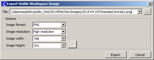 |
The configured dimensions of the Output Canvas can be used, or can be overridden.
Note: Animated-image file export will be supported with the MPEG, AVI, MNG or MOV file format, or something similar. None of the utility libraries we are currently using (including Qt) support any sort of movie-file generation. I believe that we will be able to make use of the FFmpeg, Libav, MEncoder, or GStreamer libraries, but this requires more investigation and some integration work.
Output Canvases saved within the model can be used in RiverWare Model Reports. See Section 6.
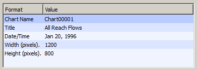
Output Canvas still images (and maybe animated movie files of some format) can be included in RiverWare model reports. The model report contains a reference to a particular Output Canvas (output device) instance saved in the model file. The reference timestep date/time (for still images), image width, and image height of the Output Canvas can either be used, or overridden in the model report configuration. The following detail shows a Pie Chart model report item's configuration.
 |
The Output Canvas View Dialog presents the canvas in a relatively static form. The only dynamic controls are those to support a single "reference timestep":
Similar to the Pie Chart device, the Output Canvas Viewer (and also the Output Canvas Preview Panel) provide a timestep slider with animation controls to allow the user to move timestep-animatable items to different timesteps within a model data time range -- and to automatically step that timestep forward at a settable rate to present an animation or slide show.
|
The Output Canvas View Dialog supports these menubar operations:
Graphical Objects on the canvas support the following context menu operations:
Teacups also support these additional context menu operations:
Double clicking on a Teacup or Flow Line object in the Output Canvas Viewer shows the Open Object dialog for the Teacup's or Flow Line's primary reference simulation object.
--- (end) ---