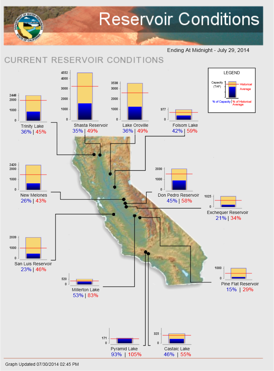
(1.1) California Dept. of Water Resources
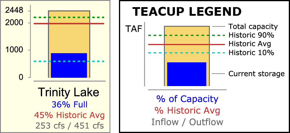
A visual tool on the California Department of Water Resources website provides a good example of the sort of Reservoir Teacup graphical element we would like to create.
RiverWare Output Canvas: Teacup and Flow Animations: Design 3
Phil Weinstein, David Neumann, Patrick Lynn, Edie Zagona, CADSWES, 8-22-2014 -- See Project Index
This document presents a design for a new RiverWare "Output Canvas" output device which can be used to illustrate water storage levels and water flows over a period of time. The initial implementation supports the following graphical elements, including two animated components:
Subsequent development of the Output Canvas output device may provide additional graphical features, such as incorporation of RiverWare Plot Page and Pie Chart output devices. Output Canvases may eventually be deployable on the web. Those features are beyond the scope of this project.
Two examples of water resource Teacup graphics are provided here to help devise a design for RiverWare Teacup items.
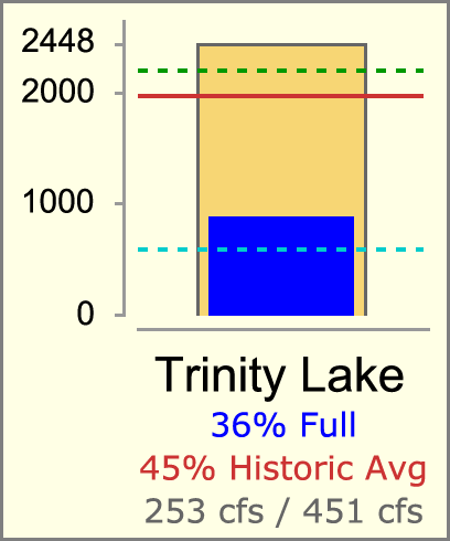
(1.1) California Dept. of Water ResourcesA visual tool on the California Department of Water Resources website provides a good example of the sort of Reservoir Teacup graphical element we would like to create. |
|
|
|
||
| Source: http://cdec.water.ca.gov/cdecapp/resapp/getResGraphsMain.action | ||
This visually depicts these quantities:
The Teacup Item also includes these text / numeric items:
The full map image depicts "callouts" -- lines connecting the Teacup image to a particular point within the map. (We will not be implementing this feature).
Most reservoirs seem to share a common vertical (volume) scale. But some smaller-capacity reservoirs have a larger scale (e.g. see Pyramid Lake at the bottom of the graphic).
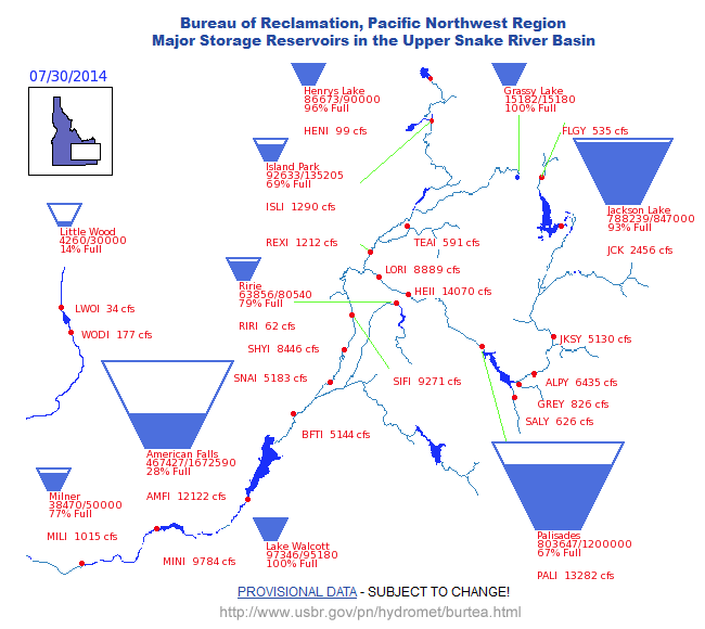 |
| Source: http://www.usbr.gov/pn/hydromet/burtea.html |
 |
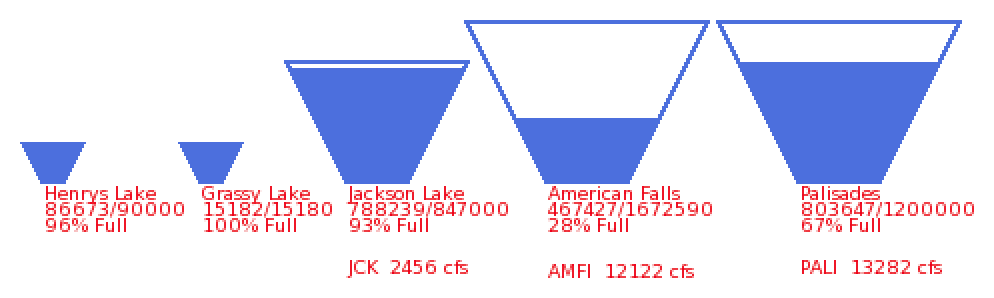 |
In this particular map, there are three Teacup "profiles" -- for different ranges of reservoir capacities. Each Teacup apparently has its own scale. The indicated flow ("cfs") text items are apparently independently placed (i.e. not implemented as part of the Teacup item). |
Observation: this trapezoidal presentation is potentially ambiguous. Ostensibly storage volumes rather than pool elevations are depicted by the filled-in area. But it's not clear whether the height or the area of the filled-in area represents that volume. And certainly the height of that area doesn't accurately represent the pool elevation.
Various types of Graphical Objects can be displayed on an Output Canvas -- a new form of graphical RiverWare output device. These graphical objects include:
Several of these objects graphically depict -- or display as text -- numeric values from slots in the model. Series slot values are indexed with a reference timestep provided by the canvas. Currently, only non-negative values can be graphically depicted.
The following sub-sections summarize the capabilities and display options for these graphical objects. See also the more detailed design sections for these objects later in this document.
Images are added to an Output Canvas by loading individual image files and are retained (as data) within the Output Canvas. Images can be displayed in the canvas with partial opacity. Particular images can be designated as "background images" which forces them to be painted "under" non-background images and changes their configuration behaviors.
Text Items can be individually placed anywhere within the canvas. Several Text Item Types are supported as outlined in the table below. Text items support the following features:
| Text Item Type | Example | Notes | |
| 1 | Plain | CURRENT RESERVOIR CONDITIONS | |
| 2 | Reference Timestep | Ending at Midnight - July 29, 2014 | Several date/time formats are supported |
| 3 | Current Date/Time | Graph Generated 07/30/2014 02:45 PM | Several date/time formats are supported |
| 3 | One Slot Value | ALPY 6435 cfs | |
| 4 | Two Slot Values | 97346 ft3 / 95180 ft3 | The two values are separated with " / ". |
| 5 | Percent | Palisades 67% Full | The percentage is based on two slot values and is presented with no fractional digits. |
 |
|
|
|
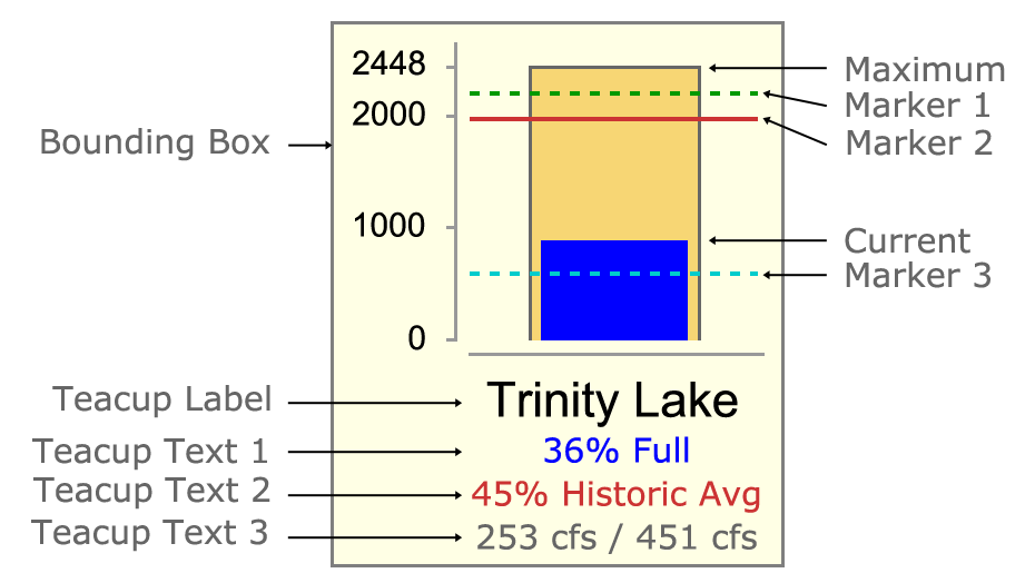
RiverWare Teacups can be individually placed anywhere within the canvas. Teacups belong to a particular Teacup Group which defines the display properties for all teacup instances in the group. Teacup instances have an associated primary simulation object (typically a reservoir) and secondary simulation object (typically a data object) which are used to identify the data sources (slots) for the values illustrated by the teacup graphic.
Teacups graphically depict individual slot values relative to the canvas' "reference timestep" using the following graphical components:
Additionally, Teacups display the following components:
 |
|
|
|
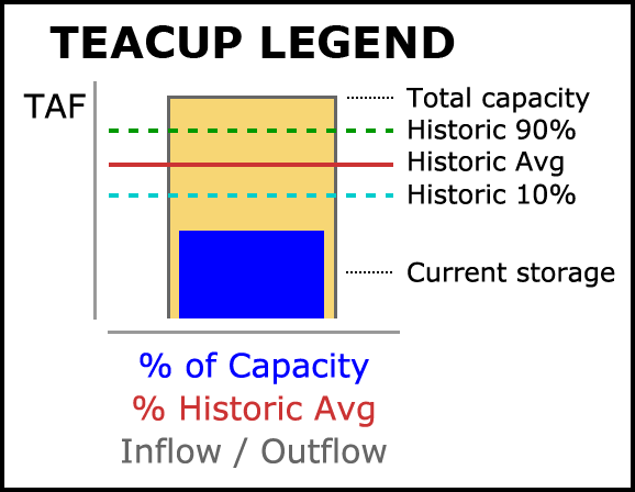
A Teacup Legend graphical image can be created for a Teacup Group and placed anywhere on the canvas. It is always drawn with a black border (bounding box) and a white background. It is similar to the teacup graphic, but with markers positioned vertically such that text labels can be placed to the right, evenly spaced. (See the accompanying image). In place of the vertical axis tick-marks with numeric values is the unit indication for those values. Only "legend text" for the Teacup Text Items is shown below the teacup bar -- no text is shown in place of the Teacup Label.
Each of the following graphical components are configured with a label or "legend text" used in the teacup legend.
Flow Lines are line segments graphically depicting an individual slot's value at the canvas' "reference timestep" with the following graphical components:
Each end of a RiverWare Flow Line can be placed anywhere within the canvas or "snapped to" any Teacup or Flow Line end. Flow Lines belong to a particular Flow Line Group which defines the display properties for all flow lines in the group. Flow Line instances have an associated primary simulation object (typically a reach) -- and optionally a secondary simulation object (typically a data object) -- which are used to identify the data source (slot) for the flow line's display properties -- and optionally to define thresholds using guide curve slots.
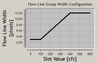
Flow Line Thickness is determined by a single function applied to all Flow Lines within a particular Flow Line Group. Specified minimum and maximum line thicknesses (widths) correspond to specified slot values. The graph to the right illustrates Flow Line Thicknesses (in pixels) as a function of slot values given this Flow Line Group configuration information:
|
 |
Flow Line Color and Line Style (pattern) reflect magnitudes relative to the slot's "capacity" (typically, water channel flow capacity). These display properties are defined in a sequence of "Flow Intervals" at the Flow Line Group level. The thresholds for those intervals are defined independently for each Flow Line Instance. Thresholds can be expressed as constant values -- or -- as references to "guide curve" slots (any slot under the Flow Line's associated objects which can be resolved to a single value, with or without a reference timestep). See the following example.
Flow Interval Configuration Example:
| Configuration at Flow Line Group
Level Flow Interval Display Attributes |
Configuration at Flow Line Instance
Level Flow Interval Thresholds (Value or Guide Curve Slot) |
||||||
| Flow Interval | Label | Color | Style | Below Red Lake | Below Green Lake | Below Blue Lake | |
| Negligable | Negligable | Grey | Dotted | ||||
| Flow Interval 1 | Low | Grey | Solid | >= 2 cfs | >= 2 cfs | >= 5 cfs | |
| Flow Interval 2 | Middle | Green | Solid | >= 10 cfs | >= 80 cfs | >= 200 cfs | |
| Flow Interval 3 | High | Blue | Solid | >= 30 cfs | >= 240 cfs | >= dailyHighSlot | |
| Flow Interval 4 | Extreme | Red | Dashed | >= 50 cfs | >= monthlyMaxSlot | >= dailyMaxSlot | |
Note that Flow Lines within a particular Flow Line Group can be used to depict any entity having a single unit type. (It doesn't have to be "Flow"; Flow Line Group has a settable unit type a property).
The Output Canvas is a new RiverWare graphical output device. Existing graphical output devices include the Plot Page and Pie Chart. The Output Canvas is supported by two major dialogs:
The Output Canvas Configuration Dialog is similar to the Model Report output device supporting an object tree and property editor with a preview panel. Only in this dialog can Teacups and other graphical features be configured and moved (dragged) to a different location on the canvas. This dialog presents OK, Apply and Cancel buttons for applying changes (or not) to the output device configuration saved within the model. A "View" button brings up the Output Canvas View dialog.
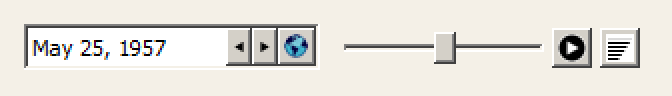
The Output Canvas View Dialog presents the canvas in a relatively static form. The only dynamic controls are those to support a single "reference timestep" -- a timestep date/time spinner with animation controls (similar to those shown in the Pie Chart output device).
|
The Output Canvas Configuration Dialog supports three main panels:
The Output Canvas output device is "workspace-like" in that it contains graphic objects which are selectable and draggable on top of an optional background image. (The Output Canvas supports multiple user-supplied images; any of those can be used as background images).
An Output Canvas is configured using a "property editor" based GUI design -- similar to RiverWare Model Reports and Scripts. The Output Canvas Dialog is composed of the following panels supporting user-adjustable "splitter" controls.
The Object Tree and Settings Property Editor can optionally be hidden. The Object Tree supports single-item selection. The Settings Property Editor shows the editable properties of the selected Object Tree item.
Related GUI controls mentioned in this design document include:
The various types of graphical items on the Output Canvas are managed within Item Groups. The following types of Item Groups are supported:
| Item Group Type | Number Supported | Special Features | |
| 1 | Image Group | One | Independently lockable canvas positions. |
| 2 | Text Item Group | One | |
| 3 | Teacup Group | One or Several* | Supports Generated Legend Graphic |
| 4 | Flow Line Group | One or Several* | The two ends can "snap to" Teacups or an end of another Flow Line |
*The initial implementation may support only a single Teacup Group and a single Flow Line Group. When multiple groups of these types are supported, they will need to have user-editable names which are enforced to be unique.
The Object Tree is initialized with the following non-deletable top-level items (assuming a single-instance implementation for all item group types):
When multiple Teacup Groups and Flow Line Groups are supported, a new Output Canvas does not initially have those top-level items (Teacups and Flow Lines). Instead, an action menu above the object tree supports "Add Teacup Group" and "Add Flow Line Group" actions.
The Output Canvas has a configured size, in pixels. Zooming in or out is not supported. Scrollbars will be shown as needed (i.e. when the Output Canvas window is smaller than the configured size). The locations of all graphical elements within the Output Canvas will generally be locked, but when unlocked, they can be dragged to a different location. This is supported with a "Lock item positions" checkbox.
Similar to the Pie Chart device, the Output Canvas provides a timestep slider with animation controls to allow the user to move timestep-animatable items to different timesteps within a model data time range -- and to automatically step that timestep forward at a settable rate to present an animation or slide show.
 |
The Settings Property Editor shows the Output Canvas' general settings when the "Canvas" item is selected in the object tree:
|
The reference timestep date/time is generally synchronized with the timestep slider shown with the canvas. Manual changes to the slider (including using the step buttons) change this value, but changes to that slider during an animation do not.
The Output Canvas can be exported as an image file (at a single reference timestep) or as an animated-image file. Supported still-image formats include PNG and JPEG. Image output dialog support is modeled on existing image export functions, for example, this dialog for exporting the workspace image:
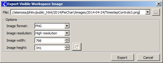 |
The configured dimensions of the Output Canvas can be used, or can be overridden.
Note: Animated-image file export will be supported with the MPEG, AVI, MNG or MOV file format, or something similar. None of the utility libraries we are currently using (including Qt) support any sort of movie-file generation. I believe that we will be able to make use of the FFmpeg, Libav, MEncoder, or GStreamer libraries, but this requires more investigation and some integration work.
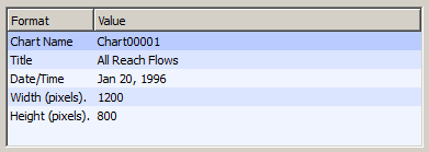
Output Canvas still images (and maybe animated movie files of some format) can be included in RiverWare model reports. The model report contains a reference to a particular Output Canvas (output device) instance saved in the model file. The reference timestep date/time (for still images), image width, and image height of the Output Canvas can either be used, or overridden in the model report configuration. The following detail shows a Pie Chart model report item's configuration within a model report.
 |
The Output Canvas supports:
The "Add" items in the context menu show the Setting Panel (which may have been hidden) with the new item selected in the object tree and the settings property editor showing the settings for that new item. The various types of canvas items also support their own context menus. Generally, operations in those item context menus apply to the full selected set of items -- see below.
Image Items can be created from basic image files (JPEG, PNG, GIF) and are saved (serialized) within the Output Canvas output device, generally contained within a RiverWare model file. Selecting the "Add Image..." operation from the canvas' context menu or the object tree's action menu brings up an image file selection dialog to allow the user to pick an image file to be loaded.
Image items support an adjustable opacity (0% to 100%). Individual items can be designated as "background images". Doing so has the following effects:
Non-background images are drawn "under" the other three types of items described in this document (but over all background images). Partially transparent background images (less than 100% opacity) are effectively blended with the Output Canvas' configured background color.
Each image has its own "locked position" toggle which prevents it from being moved by dragging; this is distinct from the canvas' "Lock item positions" checkbox. The image-specific position lock is appropriate for images used as background images.
The top-level "Images" (Image Group) object tree item doesn't have any associated settings. It contains a tree child item for each configured image in the canvas. An image item's "name" is initialized from the loaded image file's name (modified to ensure uniqueness within the canvas), and can subsequently be edited by the user. The Settings Property Editor shows the Output Canvas' general settings when an image item is selected in the object tree:
|
Text Items can contain multiple lines of text with a single selectable color. Instead of picking a potentially unique font specification for each Text Item instance, three fonts can be configured within the Text Group, and any item can be displayed with any of those fonts.
Accordingly, the top level "Text Items" (Text Item Group) object tree item supports the following settings:
|
The "Text Items" (Text Item Group) object tree item contains a child item for each text item in the canvas.
A text item can be of any of the following types. Some of these text types support references to slots in the model -- this can be a scalar slot (or 1x1 table slot) or any slot which can be resolved to a single value at a reference timestep. Most text item types support an optional user-entered suffix and prefix -- and in one case -- optional "middle" text. This set of supported text items may be extended in the future.
| ||||||||||||||||||||||||||||||||||||
The Settings Property Editor conditionally shows the following settings when a text item is selected in the object tree:
|
|
|
|
|
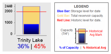
Certain aspects of RiverWare Teacups are modeled primarily on the CDWR example presented above. They present:
Various Teacup composition and display properties are defined at the "Teacup Group" level. These properties are shared among all Teacups in the Teacup Group. This configuration includes: The Settings Property Editor shows the Teacup Group's settings when a (or the) Teacup Group is selected in the object tree:
|
|||||||||||||||||||||||||||||||||||||||||||||||||||||||||||||||||||||||||||||||||||||||||||||||||||
Notes:
If the Teacup Group's "Marker Count" configuration is at least one, then that number of Teacup Marker Configuration child tree items are created under the Teacup Group tree item in the object tree. These tree items have text of the form "Teacup Marker #" (where # is an integer starting at 1). The Settings Property Editor shows the following Teacup Marker Configuration Item settings when such a tree item is selected in the object tree:
|
|
|
|
|
If the Teacup Group's "Num Text Row Count" and "Num Text Col Count" configurations result in at least one such numeric text "cell", then that number of Teacup Text Item Configuration child tree items are created under the Teacup Group tree item in the object tree. These tree items have text of the form "Teacup Numeric Text (Row <row>, <side>)" where <row> is an integer starting at 1 and <side> is either "Left" or "Right" (or blank if there is only one column).
Text Item types similar to those on the output canvas (see Section 4) are supported. Instead of data sources being references to slots in the model, data sources are the particular Teacup graphical quantitative entities, i.e. any of:
All Teacup Numeric Text Item types support an optional user-entered suffix and prefix -- and in one case -- optional "middle" text. This set of supported text items may be extended in the future.
|
|||||||||||||||||
The Settings Property Editor conditionally shows the following settings when a Teacup Numeric Text Item is selected in the object tree:
|
If the Teacup Group's "Show Bounding Box" configuration checkbox is on, then a Teacup Bounding Box Configuration ("Bounding Box") child item is created under the Teacup Group tree item in the object tree. The Settings Property Editor shows the following Teacup Marker Configuration Item settings when such a tree item is selected in the object tree:
|
 |
|
|
|
If the Teacup Group's "Show Legend" configuration checkbox is on, then a Teacup Legend Configuration ("Legend") child item is created under the Teacup Group tree item in the object tree. A legend graphic based on the design of the CDWR example is implemented -- but with support for multiple markers. Legend graphic composition is supported with settings in these other configuration items:
The Settings Property Editor shows the following Teacup Legend Configuration Item settings when such a tree item is selected in the object tree:
|
Teacups are added to an Output Canvas on demand by the user. When adding a Teacup item, or any time thereafter, the user configures the item according to a Teacup configuration established for the Teacup Group. Note: If multiple Teacup Groups are supported -- unless a particular Teacup Group is indicated with a current selection within the Object Tree -- upon creation of a new Teacup, the user is queried for the target group.
Child tree items for each Teacup instance appears under the containing Teacup Group's tree item within the object tree. The Teacup tree item redunantly display's the Teacup's label text which is also the first item in the Teacup's properties. The label must be unique within the group and will typically be the name of the simulation object represented by the Teacup. The Settings Property Editor shows the following Teacup settings when a Teacup item is selected in the object tree:
|
Since our property editor implementation (based on the rwSetting class) doesn't, and can't easily support an open-ended, variable number of items, a Teacup Marker data sources (slots) are represented as properties of child Marker object tree items (in the Object Tree) under Teacup tree items. The number of Marker object tree items is dynamically based on the Teacup Group's configured Marker Count property. Each such Marker Object tree item supports a single slot reference property:
|
All slot references can be either scalar (or 1x1 table) slots or any slot which can be resolved to a single value at a given timestep date/time.
 |
|
|
|
The basic way of creating a Teacup involves individually specifying the data sources (slots) for each of the Teacup's graphical entities (Maximum, Current, and each of the Markers). This would be a tedious process for creating a large set of Teacups.
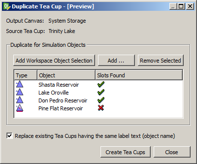
The "Duplicate Teacup" operation allows the data source (slot) configuration of an existing Teacup to be applied to the creation of multiple new Teacups for a designated set of simulation objects. This operation is accessible from various Teacup instance contexts including context menus on a Teacup canvas item or Object List Teacup tree item.
Inputs to this operation are:
The operation assumes that Teacups represent quantities related to individual simulation objects (and possibly also associated, systematically named data objects) and that Teacup labels are the names of those simulation objects.
The specific data source slot references for the new Teacups are devised by replacing the Source Teacup's name -- in the data source slots' object names -- with the name of the respective selected simulation object. A green-check or red-X icon in the object list's "Slots Found" column indicates whether that name substitution results in valid slot references.
Clicking the "Create Teacups" button creates the new Teacups and shows a message box confirming the completion of the operation and reporting its status. The operation will fail if the "Replace existing Teacups having the same label text (object name)" checkbox is not checked and such conflicts exist.
New Teacup canvas items are heuristically placed on the Output Canvas based on the relative positions of the corresponding simulation objects in the Simulation View; the user will then be able to adjust their positions by dragging the Teacup canvas items.
 |
|
|
|
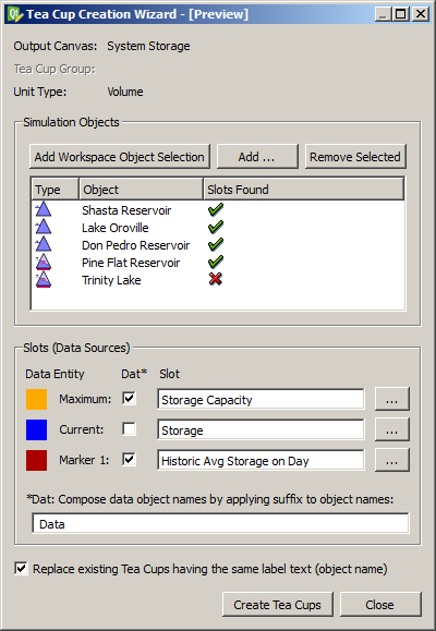
The Teacup Wizard is an additional way (similar to the "Duplicate Teacup" Operation -- see above) to create Teacups for a set of simulation objects.
The operation assumes that Teacups represent quantities related to individual simulation objects and possibly also associated, systematically named data objects. The names of data objects associated with a simulation object must be composed by adding a designated suffix to the simulation object name.
Inputs to this operation are:
The ellipsis buttons presented with each of data source slots bring up the slot name selector (based on the GUS slot selector) to select a local slot name. These local slot names can also be directly edited. (This is similar to specification of a slot name in the Unit Scheme Manager's "Add Exception" function).
The operation of the Teacup Creation Wizard is otherwise similar to the Duplicate Teacup operation described above with respect to the "Slots Found" visual indication, the "Replace existing ..." option, the operation confirmation, and placement of the new Teacup canvas items within the Output Canvas. (See the prior section).
"Flow Line" Output Canvas items convey the magnitude of a series' value at the canvas' reference timestep using line width, color and pattern. (Neither of the two reference examples above illustrate flow lines).
Generally, slots associated with Flow Lines have the flow unit type. But any single unit type can be used. This is configurable at the Flow Line Group level. (All Flow Lines within a particular Flow Line Group must have the same unit type). Potentially, multiple Flow Line Groups could be defined within an Output Canvas, but the initial implementation will support only a single Flow Line Group.
A Flow Line has a reference to a single series slot (of the configured unit type) chosen by the user. The current magnitude of the element's series (at the reference timestep) will be depicted in two ways:
The current Flow Line value is shown as numeric text along the drawn line using a font defined at the Flow Line Group for this purpose.
Either end of a Flow Line can be "snapped to" a Teacup Item or to the end of a different Flow Line or can be independently placed anywhere within the Output Canvas.
We will need to devise mouse interaction techniques for disambiguating the action associated with clicking and dragging a Teacup Item or a proximate Flow Line. Flow Lines will need two or three draggable "hot spots" for positioning -- one at either end, and possibly a third in the middle for geometric translation (moving) which could also "un-snap" the Flow Line from other items.
Various Flow Line composition and display properties are defined at the "Flow Line Group" level. These properties are shared among all Flow Lines in the Flow Line Group. The Settings Property Editor shows the Flow Line Group's settings when a (or the) Flow Line Group is selected in the object tree:
|
|||||||||||||||||||||||||||||||||||||||||||||||||||||||||||||||||
Since our property editor implementation (based on the rwSetting class) doesn't, and can't easily support an open-ended, variable number of items, Flow Line State (threshold) configuration properties are provided under child Stage object tree items (in the Object Tree) under Flow Line Group and Flow Line tree items. The number of Stage object tree items is dynamically based on the Flow Line Group's configured Stage Count property. Each such Stage tree item under a Flow Line Group supports the following properties:
|
Flow Line items are added on demand by the user. When adding a Flow Line item, or any time thereafter, the user configures the item according to a line item configuration established for the containing Flow Line Group. Note: If multiple Flow Line Groups are supported -- unless a particular Flow Line Group is indicated with a current selection within the Object Tree -- upon creation of a new Flow Line, the user is queried for the target group.
Child tree items for each Flow Line instance appears under the containing Flow Line Group's tree item within the object tree. The Flow Line tree item redunantly display's the Flow Line's label text which is also the first item in the Flow Line's properties. The label must be unique within the group and will typically be the name of the simulation object (typically a Reach) represented by the Flow Line. The Settings Property Editor shows the following Flow Line settings when a Flow Line item is selected in the object tree:
|
As previously described, each end of a Flow Line can be snapped to any Teacup or to either end of another Flow Line. The current "snapped" state of each end of a flow line is encoded in a new "Flow Line Snap Spec" rwSetting type supporting the following values:
As mentioned above, since our property editor implementation (based on the rwSetting class) doesn't, and can't easily support an open-ended, variable number of items, Flow Line State (threshold) configuration properties are provided under child Stage object tree items (in the Object Tree) under Flow Line Group and Flow Line tree items. The number of Stage object tree items is dynamically based on the Flow Line Group's configured Stage Count property. Each such Stage tree item under a Flow Line (instance) supports the following properties:
|
The threshold values above represent the "bottom" of the entity's (typically, reach's) stage value for the particular Stage. Values below the lowest threshold value are displayed with the Flow Line Group's Negligable Value Color and Line Style.
--- (end) ---